Redesign: Personal Account, Marketplace & Auction Flow

Redesign: Personal Account, Marketplace & Auction Flow

Company

Categories

Fintech / B2C

The Center for Remote Auctions (CDT) is an online trading platform for organizing and conducting auctions.

The company hired me as a UX designer to update key sections of the bankruptcy auction platform: to make product entry simpler, the lot showcase clearer, the personal account more convenient for both buyers and sellers, and complex “legal” scenarios accessible to users without specialized education.

Part of the materials is under NDA. Here is what can be shown: structure, logic, approach, artifacts, and selected screens

What I was responsible for on the project

My area of responsibility

My area of responsibility

=

UX

UX

+

Meaning

Meaning

+

Alignment

Alignment

Collected requirements:
visual, technical, regulatory

Transformed input data into clear solutions and aligned them with company owners

Handed off to development:
page and scenario descriptions, component states, and layout usage rules

Conducted research and tested hypotheses with users

Led communication with the project manager, UI designer, development team, and leadership

Built the product structure: created the site map, defined user scenarios, identified personas

Problems that needed to be solved

Problems that needed to be solved

1. Registration: a very long and complicated journey

1. Registration: a very long and complicated journey

Email authorization

Software installation on PC

PC configuration

Obtaining a digital signature

Scenario selection (or via a manager)

Risk: part of the registration process happened outside the system, and the user could give up before even seeing the full marketplace.

Risk: part of the registration process happened outside the system, and the user could give up before even seeing the full marketplace.

2. Online auction room: unique logic that is difficult to “preview”

2. Online auction room: unique logic that is difficult to “preview”

Competitive analysis was nearly impossible: access to the auction room required legal documents, and without participating in real auctions, I couldn’t study the mechanics, restrictions, or bidding dynamics.

Risk: make it look good, but get it wrong.

Competitive analysis was nearly impossible: access to the auction room required legal documents, and without participating in real auctions, I couldn’t study the mechanics, restrictions, or bidding dynamics.

Risk: make it look good, but get it wrong.

3. Too much information in the Lot Card

3. Too much information in the Lot Card

Everything had to be displayed: technical specifications, tables, files, statuses, legal texts. The business wanted to carefully integrate manager services and bank financing offers.

Risk: getting lost in information prioritization and the user not seeing what really matters.

Everything had to be displayed: technical specifications, tables, files, statuses, legal texts. The business wanted to carefully integrate manager services and bank financing offers.

Risk: getting lost in information prioritization and the user not seeing what really matters.

4. Chaotic list of requirements from the client

4. Chaotic list of requirements from the client

The project was at the intersection of law, UX, and business → many obligations and a desire to consider and implement everything at once. Calls with business owners lasted up to 3 hours every day.

Risk: overloading the system and missing implementation deadlines.

The project was at the intersection of law, UX, and business → many obligations and a desire to consider and implement everything at once. Calls with business owners lasted up to 3 hours every day.

Risk: overloading the system and missing implementation deadlines.

5. Lot creation: too many fields and terms

5. Lot creation: too many fields and terms

A complex form with industry-specific terminology.

Risk: too high entry barrier to participate in auctions, a complicated system for newcomers.

A complex form with industry-specific terminology.

Risk: too high entry barrier to participate in auctions, a complicated system for newcomers.

Project Kickoff

Project Kickoff

I started by gathering:

  • business goals;

  • technical constraints;

  • regulatory requirements;

  • expectations of different roles (bidder, seller, organizer).

Result: a unified requirement framework that design and development relied on moving forward

Result: a unified requirement framework that design and development relied on moving forward

Initiated CJM together with platform leadership

We identified:

  • where users get confused;

  • where motivation is lost;

  • where the business loses money or applications;

  • which touchpoints require guidance and education.

Result: a list of problems and solutions approved by leadership

Result: a list of problems and solutions approved by leadership

Conducted competitor analysis

Services with similar functionality were analyzed:

  • direct competitors: Tbankrot, Fedresurs, M-etc and others;

  • analogs: Cian, Sber Auctions and others.

Result: a set of working patterns for the marketplace listing, search/filters, lot card, and personal account

Result: a set of working patterns for the marketplace listing, search/filters, lot card, and personal account

Identified target audience segments and documented their pains and needs

Three main segments were identified:

  • auction participants,

  • sellers (in different roles),

  • administrators / organizers.

Result: for each segment — defined motivations, barriers, what is critical on the first screen, and which fears need to be addressed

Result: for each segment — defined motivations, barriers, what is critical on the first screen, and which fears need to be addressed

Documented the site map and prioritized tasks

Collected and analyzed:

  • list of pages and modules,

  • functionality of the previous version,

  • list of new improvements,

  • what to implement first (to hand tasks to development faster).

Result: a transparent redesign plan that made it easy to stay aligned with PM/development and keep focus

Result: a transparent redesign plan that made it easy to stay aligned with PM/development and keep focus

What was done over six months of leading the project

What was done over six months of leading the project

Marketplace listing: a clear and user-friendly catalog for property search

Marketplace listing: a clear and user-friendly catalog for property search

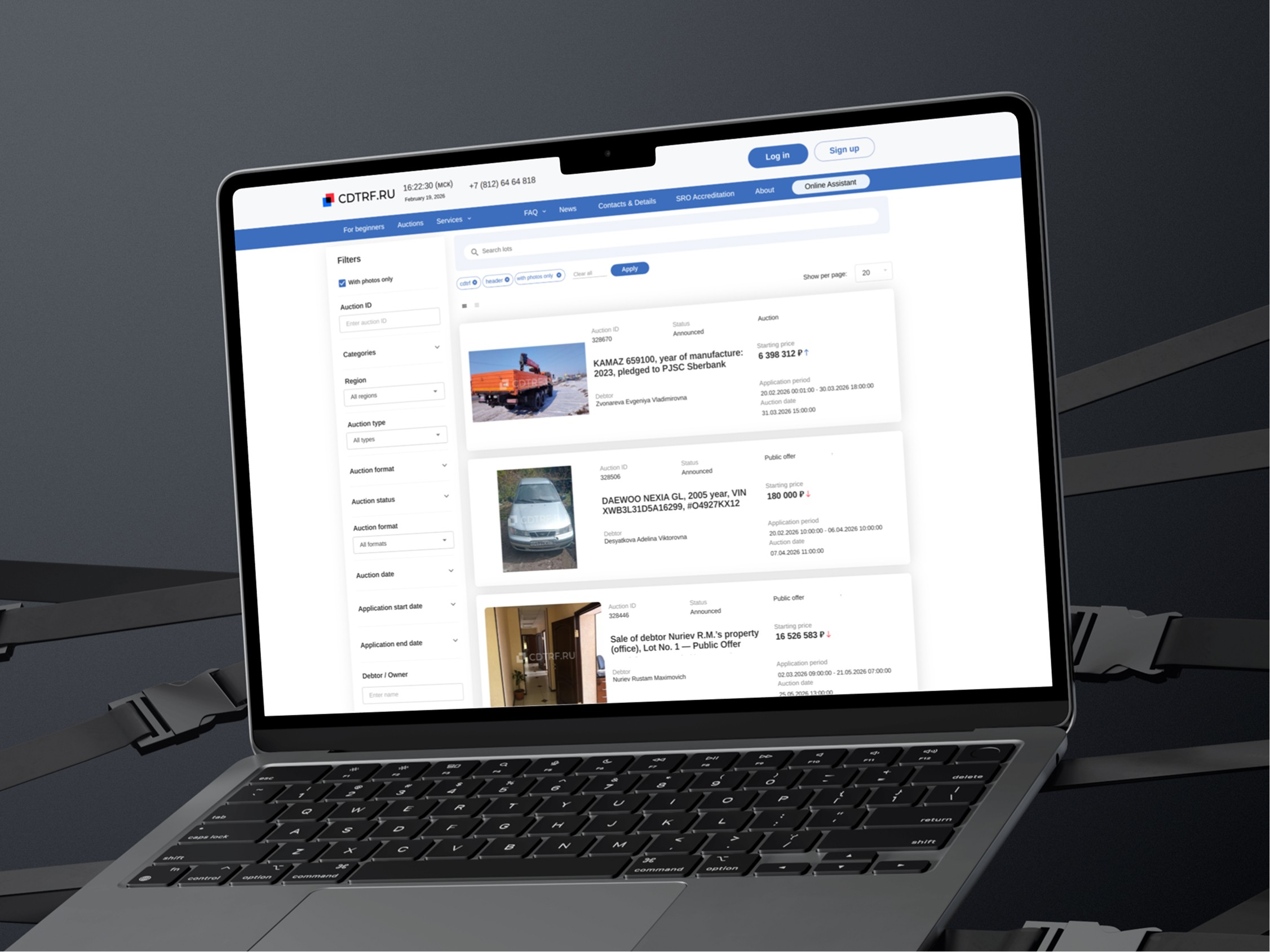
I focused on making sure the user could:

  • quickly understand what the lot is and the key purchase conditions;

  • find what they need through filters/search;

  • save a search / subscribe;

  • browse as many lots as possible in less time: table view or card view.

Lots varied significantly in content, and the card had to account for all cases: presence/absence of photos, 1–5 line titles, changing number of fields, and very long date strings.

Challenge

Online Auction Room

Online Auction Room

Unique, complex, interesting:

translated offline mechanics into a digital format;

consulted with more experienced designers via LinkedIn;

designed a clear auction screen with bidding dynamics, statuses, restrictions, and waiting logic for other bids.

Unique, complex, interesting:

  • translated offline mechanics into a digital format;

  • consulted with more experienced designers via LinkedIn;

  • designed a clear auction screen with bidding dynamics, statuses, restrictions, and waiting logic for other bids.

I couldn’t “preview” or “google” how it works elsewhere, so I reconstructed the logic piece by piece from materials about offline auctions.

Challenge

Functionality under NDA

Message me and I’ll share more details

Built-in chat for communication between buyers and sellers

Built-in chat for communication between buyers and sellers

Designed a built-in messenger that:

stores conversations and protects users from fraud and data sharing with third parties;

preserves access to the lot even after it is removed from auction;

sends push hints about the deal progress.

Designed a built-in messenger that:

  • stores conversations and protects users from fraud and data sharing with third parties;

  • preserves access to the lot even after it is removed from auction;

  • sends push hints about the deal progress.

Logically and functionally separated “Notifications” and “Messages.”
While searching for the right solution, I consulted an experienced designer from Avito, as these sections are already implemented there and researched.

Result: a clear, well-structured system of messages and notifications without duplication.

Challenge

Functionality under NDA

Message me and I’ll share more details

Personal Account with Wallet

Personal Account with Wallet

Built the logic for the “Wallet” section, which includes:

separation of cash flows into settlement account / deposit account;

top-up and withdrawal;

transaction history.

Built the logic for the “Wallet” section, which includes:

  • separation of cash flows into settlement account / deposit account;

  • top-up and withdrawal;

  • transaction history.

Visually represent multiple interconnected accounts inside the Wallet and clearly show how transfers between accounts work.

Result: added a short and simple onboarding flow for new users.

Challenge

Functionality under NDA

Message me and I’ll share more details

Lots varied significantly in content, and the card had to account for all cases: presence/absence of photos, 1–5 line titles, changing number of fields, and very long date strings.

Challenge

I couldn’t “preview” or “google” how it works elsewhere, so I reconstructed the logic piece by piece from materials about offline auctions.

Challenge

Functionality under NDA

Logically and functionally separated “Notifications” and “Messages”. While searching for the right solution, I consulted an experienced designer from Avito, as these sections are already implemented there and researched.


Result: a clear, well-structured system of messages and notifications without duplication.

Challenge

Challenge

Functionality under NDA

Message me and I’ll share more details

Visually represent multiple interconnected accounts inside the Wallet and clearly show how transfers between accounts work.


Result: added a short and simple onboarding flow for new users.

Challenge

Challenge

Functionality under NDA

Message me and I’ll share more details

Brief summary of my work

This project carried significant responsibility, so I:

Initiated discussions with leadership:
CJM, requirements, prioritization

Initiated discussions with leadership: CJM, requirements, prioritization

Defended decisions and translated ideas and proposals into working UX hypotheses

Defended decisions and translated ideas and proposals into working UX hypotheses

Guided the UI designer on structure and UX logic to ensure the visual design kept its meaning

Guided the UI designer on structure and UX logic to ensure the visual design kept its meaning

Provided development with clear descriptions of pages, states, and rules

Provided development with clear descriptions of pages, states, and rules

Kept focus on what we are building now, what comes in the next iterations, what must not be broken, and where the architecture needs to be rebuilt

Kept focus on what we are building now, what comes in the next iterations, what must not be broken, and where the architecture needs to be rebuilt

Next case: Design Systems

Next case: Design Systems